


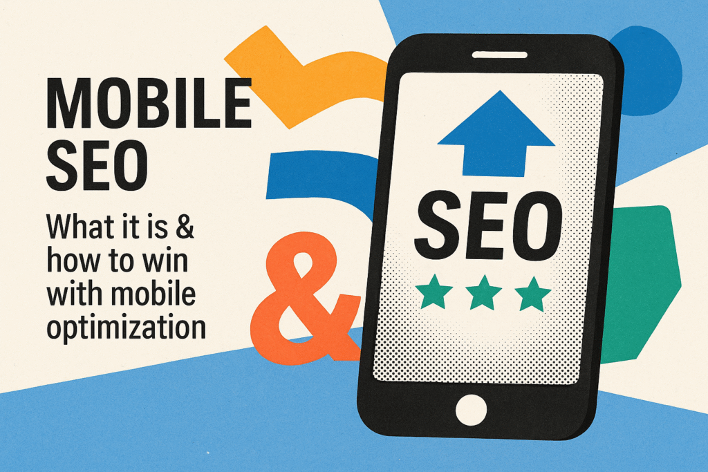
Why Your Website Must Be Mobile-Optimized to Win
Smartphones Are the New Storefront
If your website isn’t designed for mobile users, you’re not just losing traffic—you’re losing local customers.
Think about it:
- A homeowner in Grove City searches “Wi-Fi repair near me” on their iPhone
- A business owner in Butler checks out your MSP services during lunch on their Android
- A student in Slippery Rock looks up salon hours before booking an appointment
If your site is hard to navigate, slow to load, or clunky on a phone, they’ll bounce—likely straight to your competitor.
Mobile Optimization Isn’t Optional in 2025
Here’s what Google says:
“Mobile-friendliness is a confirmed ranking factor for mobile search results.”
That means if your site isn’t optimized for phones and tablets, you’re less likely to show up when people search locally.
And since over 60% of all Google searches come from mobile devices, that’s a big deal.
What Is a Mobile-Optimized Website?
A mobile-optimized website:
- Loads fast on smartphones
- Adapts to different screen sizes (responsive design)
- Uses large, readable fonts
- Features click-friendly buttons and links
- Offers simplified navigation for touch screens
- Keeps popups and distractions to a minimum
- Prioritizes user experience and speed
It’s not just a smaller version of your desktop site—it’s a strategically designed mobile experience.
Why It Matters for Local Search
✅ Mobile Searches Drive Local Business
“Near me” searches have exploded—especially on mobile.
Examples:
- “Hair salon near me”
- “Best IT support in Cranberry Township”
- “VoIP installer in Butler County”
If your mobile experience is poor, Google notices—and ranks you lower.
✅ Faster Sites Rank Higher (and Convert Better)
Google recommends mobile page load times of 3 seconds or less.
Slower sites:
- Get penalized in search
- Lose visitors to frustration
- Drop conversions
Speed = rankings = revenue.
✅ Local Customers Expect Seamless Mobile Experiences
Your future customers want to:
- Call you with one tap
- Book an appointment in seconds
- View your hours and services quickly
- Navigate your site easily without pinch-zooming
A mobile-optimized site makes this seamless. A desktop-only site loses the sale.
✅ Voice Search Is Mobile-Driven
Voice queries like:
- “Where can I get a pedicure near Harrisville?”
- “Who installs business Wi-Fi in Mercer County?”
- “Best local IT company open now”
These rely heavily on mobile usability and structured data. A mobile-optimized site + proper SEO = voice search visibility.
What a Mobile-Optimized Site Looks Like
📱 Responsive Design
Your site should automatically adjust to screen size—desktop, tablet, or phone.
Use flexible grids and scalable images.
⚡ Fast Load Times
Compress images, use lazy loading, reduce scripts, and use a content delivery network (CDN).
Google PageSpeed Insights can score your site and offer tips.
📲 Click-to-Call Buttons
Allow users to call your business with one tap from their phone.
Bonus: Include “Call Now” buttons on landing pages, blog posts, and service pages.
🔍 Streamlined Navigation
Use simple menus, avoid tiny text links, and limit scrolling.
Dropdowns and hamburger menus should be thumb-friendly.
📅 Mobile-Friendly Forms
Booking, contact, or quote forms must be easy to fill out on a phone—no pinching or side-scrolling required.
Use autofill options and reduce the number of required fields.
Real-World Example: Mobile Revamp = Ranking Boost
A local business in Clarion County had a site built in 2014—no responsive layout, slow loading, and hard to navigate on mobile.
We:
- Rebuilt the site with a mobile-first design
- Optimized loading speed
- Integrated Google Business features and mobile CTAs
📈 Results in 45 days:
- Bounce rate dropped by 38%
- Time on site increased by 52%
- Local keyword rankings improved across 5 cities
- Inbound leads from mobile tripled
The business didn’t change what they offered—just how people could access it.
How to Check If Your Site Is Mobile-Friendly
Use these tools:
- Google’s Mobile-Friendly Test
- PageSpeed Insights
- BrowserStack for testing on multiple devices
If you fail the test, it’s time to act—fast.
Mistakes to Avoid
❌ Designing only for desktop
❌ Ignoring mobile font size or spacing
❌ Using pop-ups that cover the screen
❌ Having slow load times
❌ Missing mobile calls-to-action
Need Help Going Mobile?
At NextGEN IT Solutions, we help local businesses:
- Build mobile-first websites from scratch
- Convert outdated desktop sites into mobile-friendly platforms
- Optimize for page speed, responsiveness, and conversions
- Align mobile UX with local SEO goals
- Improve rankings across all devices
📞 724-204-1950
🌐 https://nextgen-itsolutions.com/contact
Don’t let your website turn away local traffic. Give mobile visitors the experience—and the action buttons—they expect.